Hero Art + Reverse Confetti Collaboration Hop


Reverse Confetti is collaborating with Hero Arts!  We're super excited to be hopping with them with a super special stamp set:

Hero Arts is celebrating 45 years and counting. To honor our beloved industry, we have teamed up with some of our favorite friends, and have together released co-branded designs focused on friendship, giving, and community.

Born with creativity in her blood, Ellie, daughter of Reverse Confetti owner, Jen del Muro, designed this uplifting and versatile multi-step floral set for the Hero Arts Partner collaboration. Both have a passion for equality and equity, and proceeds from this stamp set will be donated to the Human Rights Campaign. We hope that this stamp set will inspire you to create beautiful cards for those that you care for and love.


We are giving away $50 gift cards to TWO lucky winners, drawn from comments left across the blog hop. One gift code will be to the Hero Arts store, and the other to Reverse Confetti. Comment on the hop by Thursday, February 25th at 11:59pm pst. The more blogs you leave comments on, the more chances to win!

Your should have arrived here from my teamie Jeanne's blog.  If not, you'll want to start at the beginning of the hop which is the Hero Arts blog.

Here's how I was inspired:


I designed two cards with two completely different color palettes.  The first one I made is the Hello, My Dear Friend:


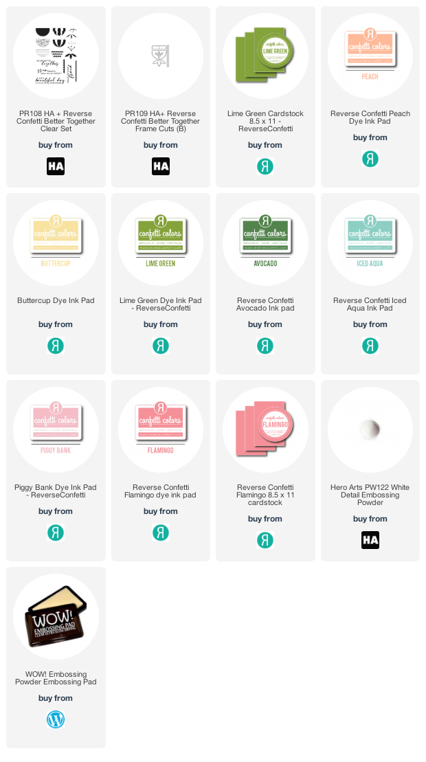
The Reverse Confetti inks I used:

Peach | Buttercup
Lime Green | Avocado
Iced Aqua

I love how this one turned out.  The sentiment was stamped in Stone.  I wanted the blooms to be the star of the show.


While I was designing my first card, this second design came to me and I couldn't wait to dive into it:


I was inspired by a watermelon color palette:

Piggy Bank | Flamingo

Lime Green | Avocado

Cardstock:  Flamingo | Lime Green

Hero Arts White Embossing Powder

Keeping things real, the center melon isn't perfectly stamped.  I decided that it reminded me of true watermelons, how they aren't always perfect.  It goes along with that beautiful sentiment.

I can't wait to hop around and see how everyone else was inspired!  Next up is my teamie Candice's blog.  In case you get lost along the way, here's the entire listing:

Hero Arts
Reverse Confetti
Kathy Schweinfurth
Lisa Henke
Jeanne Jachna
Amy Tsuruta
Candice Fisher
Tricia Barber
Amy Kolling
Audrey Tokach
Channin Pelletier
Daniel West
Ilina Crouse
Jessica Frost-Ballas
Libby Hickson
Lydia Fiedler
Maria Willis
Mindy Eggen
Seeka
Julee Tilman
Nichol Spohr

Affiliate links at no extra cost to you:

Comments

Libby Hickson said…
Love your cards Amy! The soft colors on the first one are so pretty, and the second definitely made me think watermelon! I love it!
Fikreta said…
so very beautiful cards!
Bernadette said…
Love the pastels in the first card!
Ann said…
I love the watermelon card! I also like the more muted colors you used on both cards.
SmilynStef said…
Love how your flowers look like they could be watermelons ... so lovely.
Like the positioning of the flowers on the edge for a unique look.
Melissa
"Sunshine HoneyBee"
MadeByMeghanK said…
The first one looks like watermelon! LOVE THESE!
Natalie said…
Perfect color choices, love the peachy color. And who saw watermelons in this set?! I LOVE IT! Great work.
DorothyA said…
Darling cards! Are these flowers? Are they fruit? So many possibilities and all very fun.
Gayle said…
Great cards. I love the greens and pinks on the flowers nested in a row.
Jessica Yoder said…
SUCH beautiful cards!!!
RaeAnn Duim said…
Looks like very juicy watermelons!
Carol Loumeau said…
When I first saw your flowers, I thought of watermelons. Yes. Your horizontal card shows another way to layout a card. thank you
Mary B. said…
These cards are so pretty! What a wonderful stamp set.
Geri S said…
Great cards, great colors - especially like the watermelon - and great set!!
Beverly S. said…
This is such a pretty new stamp set! I love those bold flower images but especially the colors of ink you used on your cards Amy!!!!
Patti H. said…
Totally awesome cards, Amy! I love the colors especially!
Jenny Cebollero said…
Love the watermelon theme! Very cute 😍
sharon g said…
WOW, those are some VERY COOL color combos. The first reminds me of a watermelon. YUM
Brenda said…
The colors calmed my soul!
Julia said…
Love your cards! The second one you shared reminds me of summer and watermelon with the color scheme you chose =)
cghundley said…
Love the flowers
and especially how
you used them for
the first card.
Carla from Utah
Kristina "Tina" said…
What a great stamp set. Looks like fun to play with! What a fun, inspiring blog hop!
Bev Karolak said…
Gorgeous cards! The last one reminds me of watermelons! 🥰
LOVE both of your sweet cards, Amy. One with the muted soft tones and the other reminds me of watermelons. Both are delightful using this classic stamp/die set. LOVE the cause as well, and that's make the crafting extra special.
Barbara-Jean said…
That second card actually shows those flowers growing through the soil! Love the design and the sentiment!
Kathy said…
Pink and green together - makes me feel like summer already! I like your subdued color schemes... very posh.
Barb said…
This is a beautiful Card! And, such a sweet design by Ellie and Jen! Congrats. Thanks for the opportunity to win!
Beautiful cards and colors! Thank you for sharing!
Amy Reed said…
Lovely! Thanks for the inspiration! Beautiful color combos!
Susan Y said…
Love your color choices! So much inspiration!
MaryG said…
I love the pink and green color scheme! It makes me think of watermelons and summer!
Linda Kay Smith said…
I really like the colors used here.
donna mikasa said…
You had me at watermelon! Love your cards, love the collaboration!
Sue L. said…
Amy, both r great. I LOVE, LOVE, LOVE your Grow stamp card... you used such creativity w it. ��

Happy news...I'm drawing lots and lots of hearts this week along w a special card... it's our 50th Wedding Anniversary today. Wonderful memories that are so special... especially starting at 7 pm this evening, 50 years ago, my Dad walked me down the aisle at that time. WOW. It has been an awesome time together. ����������
Andrea Hastilow said…
Fantastic card designs Amy. Do adore the watermelon colour inspiration, so fresh & fun. Really hoping that we get this set over in the UK to buy as it's one I do want. Stay safe & happy x
Nora Noll said…
Oh Amy!! I always love seeing your cards. The colors you used are just fantastic!!! Beautiful design.
I Card Everyone said…
i can't even! that 'melonized' version! so wonderful, amy...
=]
Julia Sandvoss said…
Amy both cards are absolutely adorable however that watermelon might be my favorite as it's so creative! Love it!
Wendy said…
Oh, I love them! I know what you mean about already being excited for the second card ~ there are soooo many possibilities with this set! These totally look like summer to me!! <3
Mary Holshouser said…
Love how you made stripes out
of the flowers. The layering
is great. thanks for sharing
txmlhl(at)yahoo(dot)com
anni said…
Love your cards! beautiful!!
Patty said…
Awesome cards!! I didn't even think of watermelons until you mentioned them!! They would totally make awesome watermelons by themselves!
Lagene said…
Great stamp set, Awesome creations! Lovely layouts!
Carol Wortman said…
Yup watermelons the second I saw them. Love the soft pinks. Beautiful cards!
Denise Bryant said…
So many possibilities with these designs! Love the charming flowers you created for your cards! Pretty colors!
Dee Earnshaw said…
love the muted color combos
Your cards are so pretty! Love the designs!
Ava Gavloski said…
Well done. Color selection really showcases the dies well.
Anonymous said…
Love the cards! So so beautiful!
Jeanne Beam said…
Such gorgeous cards! Love the great colors...
Thanks for sharing.
Cute cards, love the sentiments in this set
Heather said…
Two pretty cards! I definitely see watermelons on the second card! That's what watermelon flowers should look like. ; )
Nancy Knapp said…
Love your cards! Especially the watermelon card! Thanks for sharing
Helen Gullett said…
They are so very beautiful cards with those flowers.
Char said…
Calming colors and beautiful designs for this awesome set - nicely done!
Mary Ann said…
Both cards are lovely but the horizontal layout card just draws me in. I love it! Thank you for sharing.
BeverlyBL said…
Ellie did a really great job designing this fun set. Both of your cards are so pretty, and I like both color combinations.
Helen said…
Amazing how different these images look with the difference in colour! Love the designs and great use of colour! Thanks so much for the wonderful inspiration! Stay safe!
Paula H. said…
These are both so sweet! Love the softness of the first and the second definitely has watermelon vibes...makes me crave summer!
Sandy M said…
I love the softer colors on your cards. They really speak to me.
Christine Kiehl said…
What a dreamy pair of cards you made for the hop!! So creative !
IS said…
Love the colors you used. The first one reminds me of watermelons! Such a great set. Great cards!
Sue D said…
Wonderful card designs with these cute flowers.
Andre M. said…
Beautiful palettes and designs, the sentiment is so impactful! Thank you for sharing your creative cards!
sewcrazy said…
Love both of your cards! Thanks for the links to the products you used.
Annette Reed said…
Gorgeous cards! I like the color scheme of both cards but the watermelon one is my favorite. These designs are fantastic.