Coffee Loving Cardmakers and Not 2 Shabby Collaboration Hop!


The Coffee Loving Cardmaker's Design Team is so excited to be hopping with Super Sponsor Not 2 Shabby Shop!  If you hopped here from the Coffee Loving Cardmakers Blog then you're right on track.  If you stumbled upon this post, make sure you start on the Not 2 Shabby blog.  

Leave comments along the way for a chance to win one of TWO $15 Gift Certificate to be selected from participating blogs (comment on all). Must comment by November 29th at 11:59 PM PT. Winner will be announced the following week on the blog.

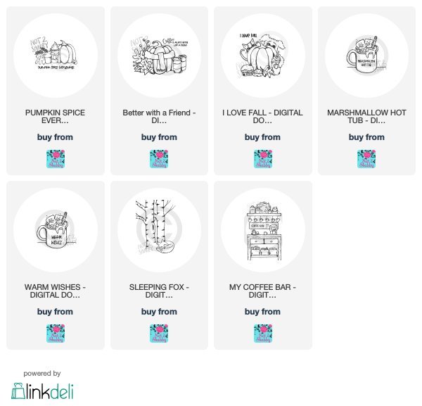
Did you know that the Not 2 Shabby shop has digital designs?

Today I'm playing with:
Pumpkin Spice Everything
Better with a Friend


Here's how they inspired me:


I had so much fun with these images!  My first card features Pumpkin Spice Everything!  I decided to use a muted palette.  Such a cute image, right?!


I wish you could see the ribbon more...it's beautiful velvet!  The pattern paper for both cards is retired Lawn Fawn.

Up next is the Better with a Friend digital.  This has been colored with vibrant color palette:


I finished off my project with some sweet polka dot ribbon.  

Which palette is your favorite?  Muted or Vibrant?

Up next is my teamie Kerry!

In case you get lost along the way, here's the hop listing:

You are invited to the Inlinkz link party!
Click here to enter
Guess What?  Not 2 Shabby is having a SALE:


Links at no extra cost to you: 

Comments

These are beautiful!! LOVING those pumpkins!!!
Amy I love your cards! Both color pallets are really nice but I'm loving the muted one! I think it's because I have a hard time doing a light muted look on my own cards. Beautifully done!! Jamie
Lori Turner said…
Such beautiful cards, Amy!! I love the plaid xoxoxo
Amanda Wilcox said…
Both of these are beautiful! I love the images too!
These are both fabulous! I like vibrant colors the best, but honestly, they are both fabulous.
I love seeing both color pallets. Brilliant! -Renee'
Lee said…
Love your coloring!!
MadeByMeghanK said…
I love your plaid backgrounds and framing! Gorgeous!
cghundley said…
Fabulous work on these
cards and I really like
the muted one.
Carla from Utah
tonyamaries said…
I love both palettes but that that touch of velvet ribbon on the muted one pushes it to the top! Well done!
Cindy Vernon said…
Your cards are really pretty.
Becca Yahrling said…
Both cards are just lovely and I like both palette's. I do think I enjoy a more vibrant one. Love the plaid!
Mary Holshouser said…
Great coloring. Love the
background papers - so "in"
for the season. thanks
for sharing.
txmlhl(at)yahoo(dot)com
maslex said…
Love both cards but the vibrant one is jumping out at me. Must be the turquoise. Love it!
Denise Bryant said…
Love both of these pretty images and your beautiful coloring! Awesome cards! Both are great but I am slightly partial to the vibrant colors!
Abby R said…
Love the plaid and all the orange.
Raquel SK said…
Adorable cards! I'm all about texture, and would love the velvety ribbon on the muted card, but the teal on the vibrant one is one of my favorite colors! Hard to choose!