I'm super excited to be a guest designer for the Color Hues Challenge! I'm a huge fan of Nancy's and love all the inspiration from the fantastic team! The challenge is Blue + Green. Thanks to Cindy for selecting my card as the overall winner for challenge TCH41.
Here's how I was inspired:

Trying out a new photog area. Having the project upright is a bit more forgiving than a flat lay. Lots of diecutting and liquid adhesive.
My cardstock hues are lime green + aqua.
.png)
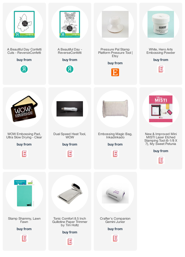
The sentiment from Reverse Confetti's - A Beautiful Day has been heat embossed in white on a dark grey cardstock:
Hope will never be silent.
-Harvey Milk
I've been wanting to design a mid-century modern project taking cues from The Queen, Laura Bassen. Make sure you also check out the fabulous Joan Bardee for inspiration too.
I didn't know where to start on the pattern itself so I found THIS canvas. Each square is 1.75 inches, based solely on the circle die that I used. I decided to go with a semi slimline to be able to include more pattern/squares for the project.
Although my project isn't rainbow themed for #pridemonth. Here's a bit about Harvey Milk from the milkfoundation.org:
Harvey Milk, was a visionary civil and human rights leader who became one of the first openly gay elected officials in the United States when he won a seat on the San Francisco Board of Supervisors in 1977. Milk’s unprecedented loud and unapologetic proclamation of his authenticity as an openly gay candidate for public office, and his subsequent election gave never before experienced hope to Lesbian, Gay, Bisexual, and Transgender (LGBT) people everywhere at a time when the community was encountering widespread hostility and discrimination. His remarkable career was tragically cut short when he was assassinated nearly a year after taking office.
I can't wait to see how the Color Hues team was inspired. We hope that you join in the fun and link up!